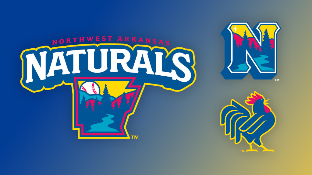
Call it a Natural progression: On Wednesday afternoon, the Minor League Baseball team in Springdale, Ark., unveiled new logos and uniforms.
The Northwest Arkansas Naturals, the Double-A affiliate of the Kansas City Royals, are named for the natural beauty of the region in which they compete. The Texas League franchise, established in 2008 after relocating from Wichita, Kan., will continue to emphasize this aspect of its identity.
��We��re proud of the connection we have with the community, with the state of Arkansas, with Northwest Arkansas,�� said Justin Cole, the Naturals' vice president and general manager. ��We didn��t want the community to think we were trying to change course completely, so when we looked at it we wanted a custom font. We didn��t have that with our [previous] identity. We wanted a more vibrant look.��
That look is comprised of a color scheme featuring red, yellow and two shades of blue. The primary logo features a natural tableau within an outline of the state of Arkansas, incorporating a river, woods and mountains. A baseball, located in the northwest portion of the logo, peeks out from beyond the mountains. This mark is featured in both the yellow home cap and the red away cap, with a star in place of the baseball.

The logos were designed by Torch Creative, a design studio based out of Dallas, Texas. Cole said that his organization had been impressed by the work that Torch Creative had done for the Midland Rockhounds, who are also in the Double-A Texas League.
��They toured around, and between combining some of the ideas we had versus what they saw, they came back with exactly what we were envisioning,�� said Cole. ��I think it��s a good encapsulation [of Northwest Arkansas]. There are a few state parks around us, Devil��s Den is probably the most well-known in the region. I think they drew some inspiration from that.��
When Northwest Arkansas held a "name the team" contest prior to its inaugural 2008 season, Thunder Chickens was the runner-up. The team has suited up as the Thunder Chickens in the past, switching more recently to a Growling Chickens alternate identity. These fowl monikers are an homage to the presence of the poultry industry in the region, as Tyson Foods and George��s Chickens are both based in Springdale. Capitalizing on this backstory, the Naturals have unveiled an alternate logo featuring a chicken.
��Employment in the poultry industry is synonymous with our hometown, with our region,�� said Cole. ��We thought it was great as a BP [batting practice] cap to start, and we have a lot of variations we can play with over time. �� It��s going to start a little on the periphery, but I do think eventually it��s going to work its way into some of the future iterations of this new look for us.��

The Naturals might also one day incorporate the second meaning of their name into their look. The team is owned by Rich Entertainment Group, which also owns the Triple-A Buffalo Bisons. Portions of ��The Natural�� were filmed at Buffalo��s War Memorial Stadium, and the success of that 1984 film was a boon to the organization. Cole said that highlighting this connection is something the Naturals "intend on doing" in the future.?
The Naturals unveiled their new look at what Cole described as an ��intimate event�� at Arvest Ballpark. They��ll now work on spreading the word and updating the ballpark while also, of course, selling merchandise in the team store and online.?
��The key is get it launched, hopefully get a great response and then continue to carry that momentum into our opener in April,�� he said.
The Naturals begin their season at home on April 5, hosting the Tulsa Drillers for a three-game series.
