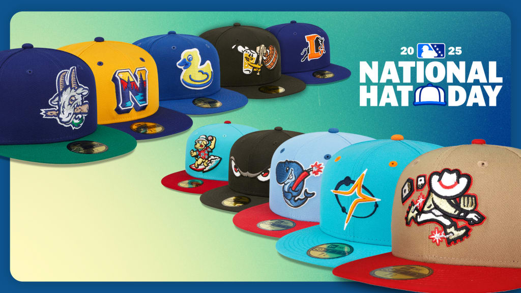
We are celebrating the small yet mighty canvas that is the Minor League cap for National Hat Day.
Clubs across the Minors utilize them as a fun way to represent their teams, regions and sometimes even their parent organizations. Not to mention they also look pretty sweet. Here's a close look at 10 of the top-selling hats from 2024, per New Era and MiLBStore.com.
But first, a few honorable mentions. Albuquerque's Mariachis de Nuevo M��xico, which has claimed the Copa de la Diversi��n three times, remains a popular look. Rancho Cucamonga's Copa design, Chaquetas, was so sought after, it's sold out. The Kannapolis Cannon Ballers' home cap also continues to pop off the shelves.
Hartford Yard Goats
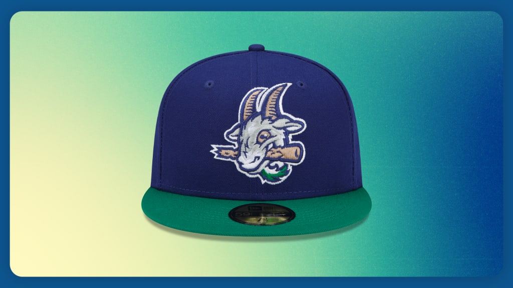
It��s been almost eight years since the central Connecticut club unveiled the Hartford Yard Goats brand, and folks still can��t get enough. The Double-A Rockies affiliate's home cap features a ��family-friendly�� goat that harkens back to the town��s railroad history. A Yard Goat is ��a hardworking locomotive that moves trains from track to track, keeping the rail yard moving. A Minor League Baseball player is like that Yard Goat, working hard in his Minor League city to keep his Major League affiliate on track," team president Tim Restall said after the unveil. The Yard Goats added green to their home cap prior to the 2023 season to further connect with the city��s history and the defunct-but-beloved Hartford Whalers hockey team. Shop ?
Northwest Arkansas Naturals
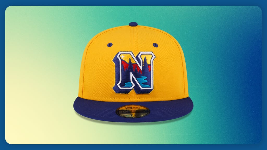
Last offseason, Northwest Arkansas�� branding got a refresh, but remained all Natural. This home hat features a strong yellow crown with a rich purplish-navy bill and eyelets. The Royals�� Double-A club was going for a vibrant look with the new logo, which features a river, woods and mountains that can be found in the state. A star in the northwest corner of the logo ties it all together. ��I think it��s a good encapsulation [of Northwest Arkansas]. There are a few state parks around us, Devil��s Den is probably the most well-known in the region. I think they drew some inspiration from that,�� Justin Cole, the club��s vice president and GM, said following the unveil. Shop ?
Akron RubberDucks
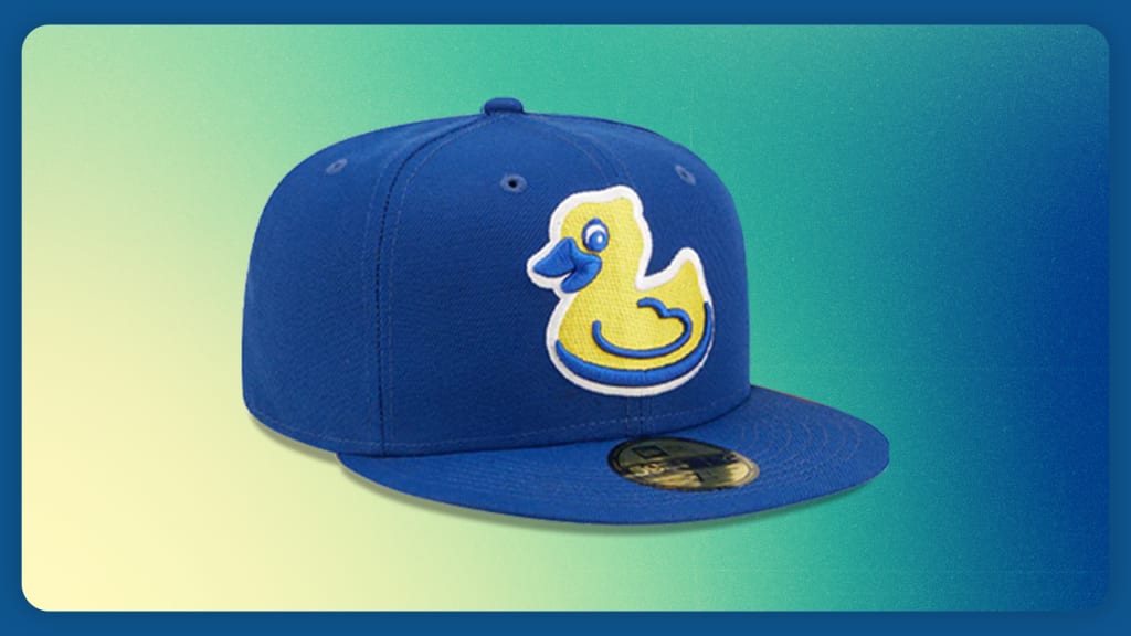
When Akron was changing its name from the Aeros to the RubberDucks in 2014, there was some concern the playful bath toy wouldn��t strike the right chord for a competitive baseball team, so the club made sure it was a fierce waterfowl. Ironically, a cute toy-like design is now the club��s most popular logo. In 2018, the Guardians�� Double-A affiliate came up with this fake throwback, or ��fauxback,�� design of what the logo would have looked like had the RubberDucks been around in the '70s. Now they rock the look every Sunday home game. Akron merchandise manager Luke Trese said the bright blue and yellow provide a calming combo that not only attracts Akron fans, but also all kinds of rubber duck enthusiasts. Shop ?
West Michigan Whitecaps
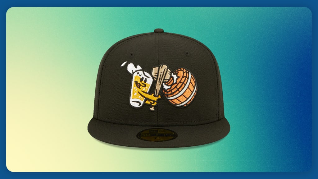
When looking for an alternate identity, Detroit's High-A affiliate wanted to honor Grand Rapids�� title as Beer City, USA. Enter: Bung Hammers. This design features a pint of beer swinging a hammer like a bat, knocking the cork -- or bung -- into the barrel of craft beer. Since its inception in 2018, the cap has remained popular, even cracking this list in 2023. Tigers No. 2 prospect Max Clark said he is not sure what a Bung Hammer is, but he loved wearing the cap while playing there last season anyway. ��It��s a pretty sick hat,�� he said. ��I��m definitely keeping this hat.�� Shop ?
Durham Bulls
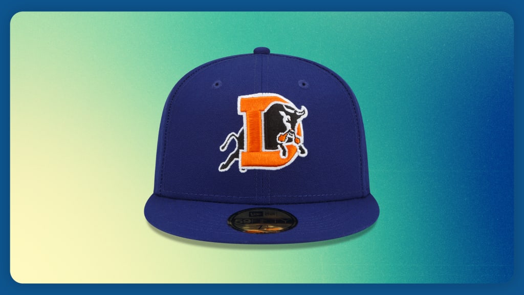
It��s no surprise the Durham Bulls�� home cap remains on this list, given the club's iconic status in Minor League Baseball history. From the movie ��Bull Durham�� to the famous ��Hit bull, win steak�� sign, this is an ��if you know, you know�� franchise. And the hat is the embodiment of that. The Rays�� Triple-A club��s cap features a snorting bull charging through an orange "D" for Durham. With a solid dark blue background, the orange really pops. And while some may say it looks like the Denver Broncos�� throwback logo (which has a horse, not a bull), this cap certainly grabs the attention of fans by the horns. Shop ?
Las Vegas Aviators
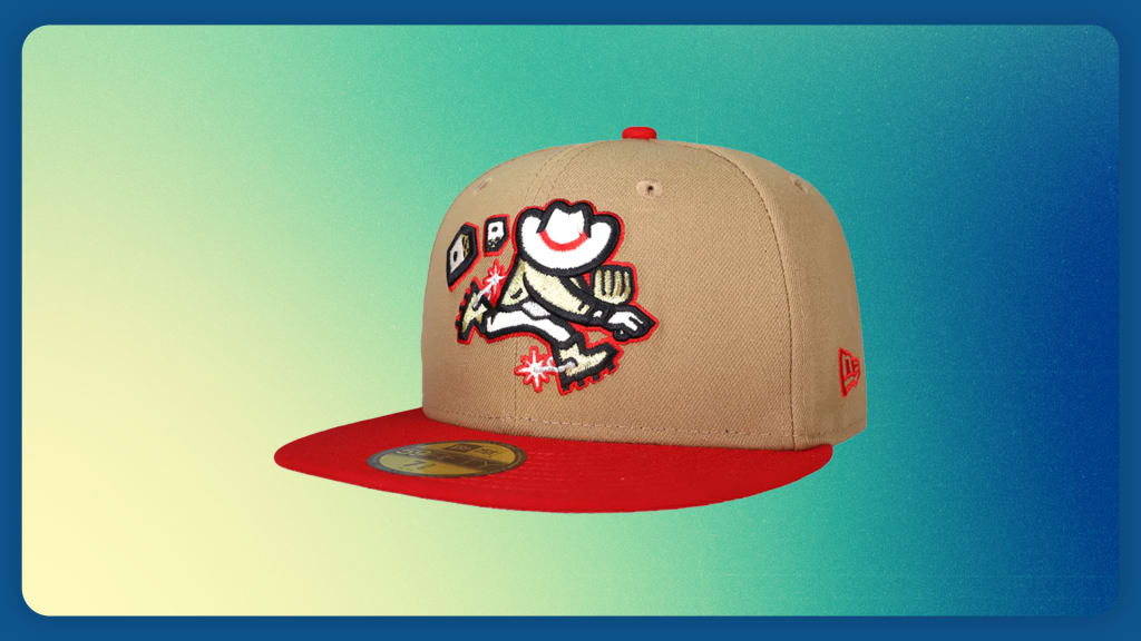
Last season, Las Vegas introduced an alternate identity that celebrates one of the activities the town is most known for: gambling. The Las Vegas Gamblers hat comes in red, black and khaki -- colors found on poker chips. The primary logo features a belt and spurs that connect to the "Welcome to Las Vegas" sign while the set of dice meaning is two-fold. The snake eyes are for the city��s 1911 incorporation date while the fives relate to the roman numbers ��LV.�� What��s more, the theme night proved lucky for the A��s Triple-A club, which won while playing as the Las Vegas Gamblers. Shop ?
Sugar Land Space Cowboys
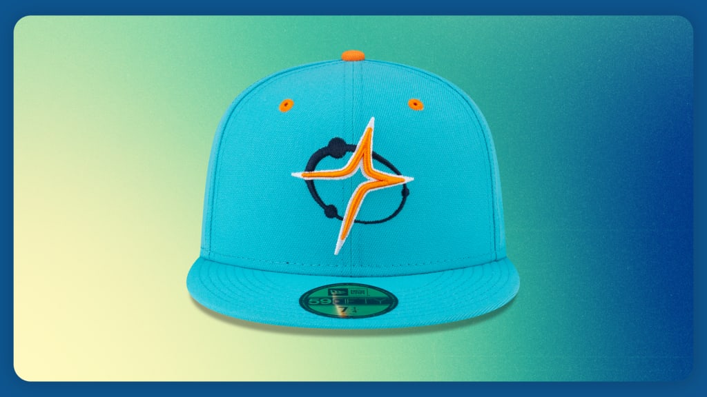
After rebranding as the Space Cowboys in 2022, Sugar Land began to think of an alternate look that could be a twist on its new identity and Houston ties. The result was a ��fauxback�� design that utilized the club's existing eye-catching color palette in a new way. While most Space Cowboys designs use navy for a space-like, image-defining backdrop with a lighter blue appearing sparingly, this cap gives the lighter blue the spotlight. The shape of the orange star, which is taken from the Space Cowboys�� visor, is a nod to their parent club, the Astros. Marketing director Amy Johnson said players love the look as well and rocked it for workout day ahead of the Triple-A National Championship, which they went on to win. Shop ?
Eugene Emeralds
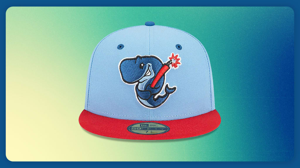
Eugene��s alternate identity continues to be the bomb. The Exploding Whales design was created to honor a famous -- or infamous -- moment in local history: the ill-fated attempt to use explosives to dispose of a whale carcass on an Oregon beach in 1970. Sky blue is the fitting background for the signature smirking whale holding a stick of dynamite like a bat. The Giants�� High-A club suited up as the Exploding Whales six times in 2023, then doubled it in 2024 as the design, well, exploded in popularity. Shop ?
Lake Elsinore Storm
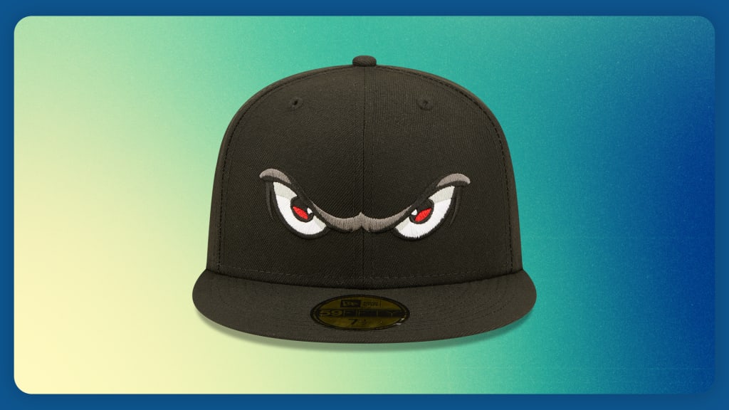
They say beauty is in the eye of the beholder. But sometimes it��s in the eyes of the ballcap. The design, which is a play on the ��eye of the storm,�� has been Lake Elsinore��s road cap since 1997, and it continues to attract fans both in Southern California and beyond. At first glance, all you see is the whites of the eyes, then the fierce red irises and finally the angled brow to show this thing means business. And it all jumps out from a stark black background. The Padres�� Single-A club��s cap is the true definition of see and be seen. Shop ?
Clearwater Threshers
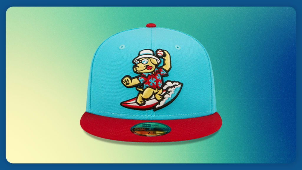
When Clearwater was choosing a new name in 2004, Beach Dogs was the runner-up. So since 2018, the club has celebrated what could have been with an alternate identity. The Phillies�� Single-A club always wears red pinstriped pants and red cleats at home, so merchandise manager Shan Isett wanted something that could match that and perhaps be a play on Philadelphia��s primary colors. The result was swapping the royal blue for vice blue and it really pops against the red bill. The lovable golden retriever is having a ball, literally, winding up in its tourist shirt, hat and sunglasses while surfing. Fans of the Threshers and canines in general chase this cap. Clearwater players sport the look for every bark in the park game so dogs can be in the stands as well as on the hats. Shop ?

